PingPlotter Cloud Manual
Dashboard View
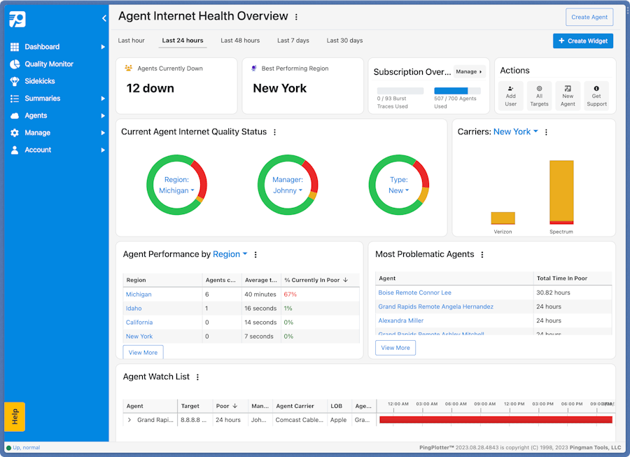
The Dashboard gives you a high level view of PingPlotter so that you can easily keep an eye on what matters most. Add or remove widgets at your leisure; change how the data is displayed; group by Carrier, Region, or any custom grouping you choose. Make this view what it needs to be for you.
The Widgets
The widgets are broken down into two groups:
Data Widgets
- Donuts - a great way to visualize groups of agents by with a filter applied. You can quickly change donut settings by using the dropdown button in the middle of the donut, and add more donuts to the card in edit mode.
- Bar Graph - allow grouping, and filtering of quality data. You can quickly modify the filter once you've set up your widget from the header of the widget.
- Pivot Table - a tabular view of a grouping or aggregation, with some column customization functionality.
- Detailed Quality Table - a mini Quality Monitor view that shows Agents using specific filters.
- Condensed Quality Table - a tabular view that shows Agents that have poor signal quality and match certain criteria.
Overview Widgets
- Total Agent Downtime - total amount of time spent in poor quality across all Agents
- Agents Currently Down - total number of Agents currently experiencing poor quality
- Total Agent Uptime - total amount of time spent in good quality across all Agents
- Best Performing Region - the region with the highest quality
- Subscription Overview - an overview of the number of Agents and Burst Traces in use
- Quick Actions - an overview of the number of Agents and Burst Traces in use
- Agents Overview - an overview of the number of Agents and Burst Traces in use
- Templates Overview - an overview of the number of Agents and Burst Traces in use
- Alert Log - an overview of the number of Agents and Burst Traces in use
- LiveShares Overview - an overview of the number of Agents and Burst Traces in use
- Summary Overview - an overview of the number of Agents and Burst Traces in use
Customize the Dashboard
Adding Widgets
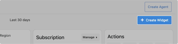
Click the + Create Widget button in the upper-right to add a new widget to your dashboard.
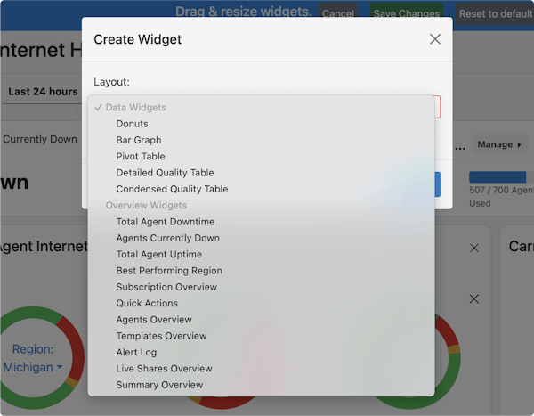
Select the Layout. Some Layouts require you to also choose how to Group and Filter the data. The data can be grouped/filtered by default fields like Carrier or Region, or even by any Custom Agent Fields you've created.
Once you have everything set select Create. The new widget will be added to your dashboard. Click and drag to move the widget to the desired location; resize by dragging the bottom-right corner. Select Save Changes in the top when finished.
Changing the Layout
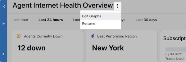
Each widget can be resized and re-positioned to fit your needs. To change the layout click on the vertical ellipses next to the dashboard name and select Edit Graphs.
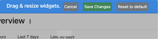
With the blue banner across the top, you are now in Edit Mode.
Click and drag any widget to reposition it. Resize widgets by clicking and dragging the bottom-right corner of the widget. The red drop shadow indicates where the widget will be places when you release the mouse-click. Select Save Changes at top when finished.
To rename the dashboard, click on the vertical ellipses next to the dashboard name and select Rename. Type the new name and select OK.