Version 5 Manual
PingPlotter Manual
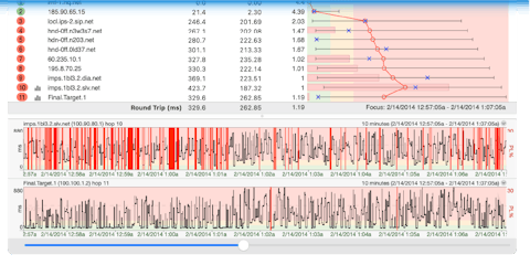
A network connection probably isn’t something you think about on a regular basis. When it isn’t working right (or stops working all-together)… well, that’s a completely different story. At that point, it’s *all* you can think about. The only thing that’s worse than your network connection not working? Trying to figure out why it’s not working.
If you’re reading this, odds are you’ve encountered (or are currently encountering) this exact situation. Or maybe you’re just preparing yourself ahead of time (go you!). No matter your current network situation, PingPlotter can help you get to the bottom of these kinds of problems faster, so you can find a solution and get back to not having to think about your connection.
PingPlotter was originally created in 1998 to troubleshoot unacceptable lag in an online game (a problem which that particular ISP was claiming no responsibility for at the time). Over the years, the program has grown, and added a variety of features and capabilities. Today, it’s a very powerful network monitoring, troubleshooting, and diagnostic tool, which is used by a variety of users - from the “weekend troubleshooter” to full-time network administrators.
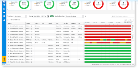
PingPlotter can help with a variety of different network related woes - and can be a great help to you if:
- You rely on a network or internet service, which happens to be having problems - such as slow performance, random disconnects, or other similar issues.
- You’re a systems administrator - and you need to know when connectivity to one of your servers goes down (and want some evidence of where/when/why it went down).
- A provider is telling you that they can’t see any problems (when you’re clearly having issues) - and you need to show them where the problem really is.
In general, if you’re a user of something that relies heavily on a network or the internet, such as:
- A web browser
- VoIP services/video chat
- Online gaming
- Streaming audio/video
- An ASP for your business (such as payroll, accounting, human resources, etc)
- Home automation products
If you ever have any questions or comments concerning PingPlotter, this guide, or if you just want to email someone to say "hello" - please feel free to send us an email at info@pingplotter.com. We’re always happy to answer any questions or provide any advice that we can!