Version 5 Manual
Export to CSV
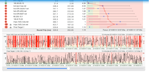
This feature allows you to export the same data shown in the Trace Graph but for over a period of time. This can be extremely helpful if you want to compare how a target was performing over different time periods.
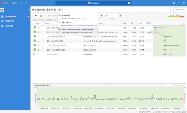
To start, select your target, click the Share button at the top of the page, and select Export statistics over time.
A modal will pop up where you can select the options for your export:
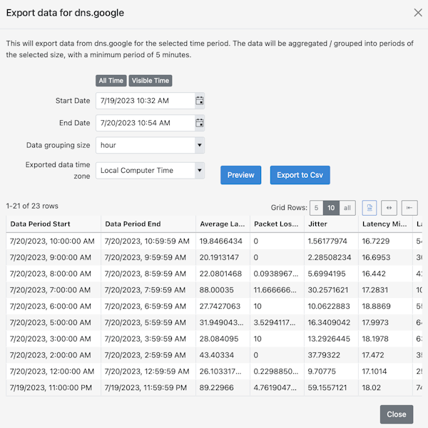
- All Time - select this option to export all data.
- Visible Time - select this option to export the data currently being viewed in the Timeline Graph.
- Start Date - select the beginning date of the export.
- End Date - select the end date of the export.
- Data grouping size - how your data is aggregated. For a more granular analysis, select a smaller grouping. You can get as low as 5 minutes. For a quick overview, select a larger group like a day or a week.
- Exported data timezone - select the timezone for the export: Local Time or UTC.
When you think you've got it set up the way you want, select the Preview button. The preview will be available below. Notice how each row corresponds to the grouping size selected above. If this doesn't look the way you want, make your adjustments, and hit preview again. When you've got it just right, select either Export to Excel or CSV. Your file will download immediately.
Why do I need a spreadsheet?
You may find yourself wanting to do a more detailed over-time-analysis than what you can see using the timeline graph. Maybe your service provider wants to see numbers rather than a pretty PingPlotter graph (we've heard it before!). Or maybe you want to see the data in a slightly different form, like a bar chart. By downloading your PingPlotter statistics to a spreadsheet and manipulating the data in a program like Excel, you'll have a lot more freedom with how your data is presented.