The Interface - Graphs
The graphs are where PingPlotter really shines. At a glance, you're able to visually see where a problem lies. There are actually two graphs available, the Trace Data Graph, and the Timeline Graph. We'll explore both in this section, as well as some other items related to them. Please refer to the below image (annotated with numbers) that we've saved from PingPlotter ("File" -> "Save Image"), and the explanations (referencing the numbers) below the graphs.
The upper graph is called the Trace Graph. All columns on the trace graph are re-sizable. The lower horizontal graph is called Timeline Graph.
All numbers on the trace graph use the "Focus Time" setting to control how many samples are used in the calculations. By default, you're looking at the most recently collected samples - but you can also focus on samples that are not the most recent samples by double-clicking on the time graph. This will focus the upper graph on that period you double-clicked (we cover this topic in a bit more detail below).
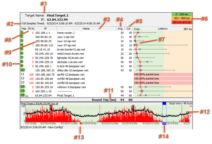
1 - The DNS name and IP Address for the host you're doing the trace to - in nice big letters so you quickly know which trace you're looking at.
2 - Beginning and ending times/dates for the trace. Very useful if you're saving off graphs. It's nice to know the time window the trace was done in. On "Copy as image" or "Save as image"-created images, you'll see the "XXXX samples timed:" value used to create this graph (where XXXX = "Focus Time"). In the live application, this line isn't shown because it is available elsewhere.
3 - This column shows the DNS name of the device for that hop. A "----------" in this column indicates that PingPlotter was unable to resolve a name for that device's IP address. This is not a flaw in PingPlotter, it just means that your DNS server doesn't have a name for that IP address (or that address just doesn't have a DNS name, period).
4 - The Avg column shows the average response time of the last "X" samples (where "X" is the "Focus Time"). Any timeouts/lost packets are not included in this value.
5 - The Cur column shows the individual sample time of the most recent sample included in the set. If a number is displayed as ERR, that means the packet was lost (i.e.: a packet was sent out, but never made it back).
6 - Shows you the thresholds you've set for the colors on the trace graph background. In this case we've set 200ms as the warning color, and 500ms as what we thought was a critical speed (PingPlotter defaults to 200ms and 500ms for these values, however, you can change them in the Display section of the Options dialog available under the Edit menu).
7 - The red line on the graph represents the average response time for each host for the currently selected samples.
- The blue X represents the response time for the current packet (this can be turned off if you're sending a copy of your graph to somebody - some folks find it confusing when they're not actually there watching the live trace).
- The black horizontal lines represent the minimum and maximum response times.
- The red horizontal bar shows the packet loss for that hop (same as the PL% column, but there for readability). PingPlotter uses a dynamic scale for its graph. The bottom number is usually 0, and the top number represents the maximum response time in milliseconds. If you wish, you can change this to a fixed scale in the Display section of the Options dialog available under the Edit menu.
8 - The PL% indicates the number of packet(s) that have been lost in the current sample set. If you're only including the last 10 samples, then only the number of lost packets in the last 10 samples are shown here. If you want to find out how many time-outs have happened over the entire session, change the "Focus Time" to "0" or "All."
9 - The IP address of the router that reported back for that hop.
10 - The number of hops that device in the route is from your computer. If a hop a bell icon next to it, this means that hop is being monitored for an alert (alerts are covered in the advanced settings section of this tutorial). Multiple alerts can be configured for the same IP, and alerts don't work unless some IP in your current route is being monitored. If a hop has an graph icon next to it (like hop #16), that hop is being traced on a time-line graph.
11 - The Round Trip line is basically there for ease of reading. It's the same value as the last server in the route. This is the time it takes for a ping to get from your computer to the target device and back.
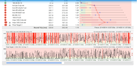
12 - The Timeline Graph (TG) is one of the most powerful features in PingPlotter, and great for long-term monitoring projects you may be doing.
-
- A red line on this graph denotes a time-out for that period. Double clicking anywhere on the graph shows you the trace data detail for that period in the upper graph (denoted by a blue "focus area" like you see in the example above - the "Focus Time" setting controls the number of samples encompassed by the "focus area"). This allows you to see what was happening along the route when that particular time-out occurred.
-
- Right clicking on the TG allows you to pick the time period you want to view - from 60 seconds up to 48 hours. This value affects all timeline graphs. If you'd like to add additional time periods you can do so by modifying your PingPlotter.exe.ini file. This is covered in the Advanced Topics and Tips - Timeline Intervals section of this tutorial.
-
- You can slide the graph (by doing a "Click-Drag"), allowing you to look at the past data for this trace. You can right-click and select "Reset focus to current" to move all graphs back to the current time. If you've been running the trace for a long time, it's helpful to adjust the time period you have set before you start moving back in the history, i.e. if you're going back a couple of days you might want to set the time period to 24 hours first.
-
- You can see a TG for any hop by right clicking on that hop in the trace graph and selecting "Show this timeline graph". You can also get rid of that graph by right clicking and deselecting it. A graph icon appears next the hop # to show that a graph is being shown for that hop. A shortcut for this is to double-click on a hop # to show / hide the time graph.
-
- We discuss time graphs a bit more in the "Timeline Graphing" section.
13 - Comments are denoted by a red up arrow, and are a very handy feature enabling you to add a comment (that is saved when you save the sample set) for things like planned outages, configuration changes or whatever else you want to make a note of.
14 - Double clicking anywhere on the timeline graph will bring up a Focus Area, which will focus the trace data graph (top graph) to that particular point in time. This is particularly useful for investigating spikes or time-outs
Tools and other options available for the Trace Graph
- You can display the Minimum and Maximum columns by right clicking on the upper trace graph and selecting them (via the "Customize View..." option).
- You can copy the IP address or DNS name for a hop to the clipboard by right-clicking on that hop, selecting the Clipboard option and then clicking on what you want to save.
- You can do a WhoIs on a particular hop by right clicking on it and selecting WhoIs Information. Note that by default this queries whois.crsnic.net. You can add additional WhoIs servers by editing your PingPlotter.exe.ini file. Instructions for doing this are in the Advanced Topics and Tips - WhoIs section.
- You can lookup who owns the particular IP range a hop is in by right clicking and then selecting "IP Block Lookup (ARIN)".
**Some of the features listed in this topic are only available in PingPlotter Pro and/or PingPlotter Standard. See our product comparison page for more details**