PingPlotter Cloud Manual
Target Controls
Target Controls has three main components:
-
The Target Bar, where you configure and activate specific Targets from your Agents
-
The Target Session Data, where you can find detailed diagnostic data for your Targets
-
Timeline Graphs, which display network performance over a given timeframe
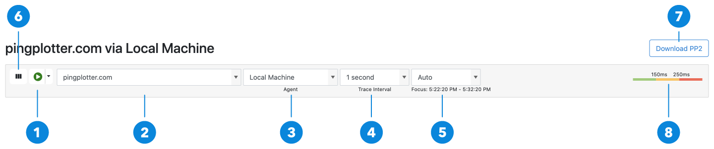
Target Bar
The Target Bar contains settings and details used to configure PingPlotter Cloud Target sessions.
-
Start/Pause Button
Activate a new Target session or pause a running Target session. Clicking the dropdown option on this button will let you Reset & Restart a Target session (which begins a completely fresh session to that target and archives previous data), create a New Target, or Stop and Close the current Target session. -
Target entry
Enter the DNS name or IP address of the target you wish to activate as a Target. The dropdown will show a list of your most recent Targets, as well as a few preset options. -
Agent Selection
Specify on which PingPlotter Cloud Agent you wish to activate the Target session. You can search for an Agent by name, or use the dropdown to see a list of deployed Agents. -
Trace Interval
Set the frequency with which PingPlotter Cloud sends its packets. -
Focus Period
Sets how much data PingPlotter Cloud displays in the Target Session Data display. Auto displays all the data currently shown on the Timeline Graph. -
Download PP2
Save a copy of your PingPlotter Cloud data. -
Change Column
Add or remove columns from the Target Session Data display. -
Graph Color Legend
Displays at which latencies PingPlotter Cloud's graphs will depict grades of network quality. These values may be adjusted from within the Settings screen.
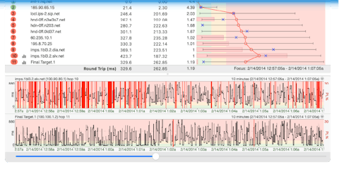
Target Session Data
The Target Session Data is made up of two parts: the Data Table and the Latency Graph.

The table on the left shows the raw details of each hop between an Agent and the Target. The graph on the right is the Latency Graph, which gives you a visual representation of the latency data for easy parsing.
Data Table
-
Hop Number
This lists the order of hops between you and your target. A circle denotes an active hop and is color-coded to show latency based on the Graph Color Legend. A graph icon shows which hops have a Timeline Graph open (more on that later). -
Count
The number of packets sent during the current focus period. -
ERR
The number of lost or timed-out packets sent during the current focus period (not shown by default). -
IP Address
The IP address of the device at the hop. -
DNS Name
The name of the device at the hop. If this is blank, it means the network device doesn’t have a DNS name or is not responding to the packet type currently being used. -
Avg
The average ping response time for the current focus period. This average ignores timeouts and lost packets. -
Min
The fastest ping response time for the current focus period. -
Max
The longest ping response time for the current focus period. This value ignores timeouts and lost packets. -
Cur
The response time for the last packet sent. If you see “ERR,” the last packet sent was lost. -
Jitter
The current network jitter average for the current focus period. -
MOS
A synthesized Mean Opinion Score based on the current network conditions. -
Packet Loss %
The percent of lost packets over the current focus period. -
Notes
A space to add information about a specific hop or trace (not shown by default).
Latency Graph

Average latency for the current focus period. This average ignores timeouts and lost packets.

The response time for the last packet sent.

The range of latencies recorded for a specific hop during the current focus period.

A connect-the-dots to help you visually track hop latency.

A color-coded representation of latency, as defined by the Graph Color Legend in the Target Bar.

The percent of lost packets over the current focus period.
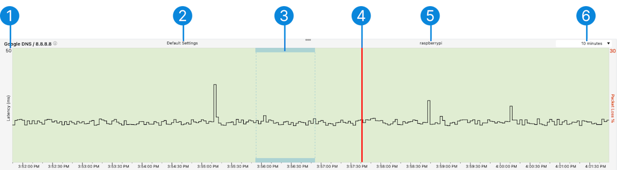
Timeline Graphs
The Timeline Graph is a visual representation of your collected Target session data. It helps you see the fluctuations in network performance over time.
-
Latency Scale
The ping round-trip time to the selected hop. -
Configuration Settings
The packet configuration used for this Target session. -
Focus Area
The section of collected data currently being displayed in the Trace Graph. -
Lost Packet
An indicator showing a packet sent in the trace session that timed out. -
Agent Name
Name of the Agent where this Target session exists. -
Timeline Scale
Adjusts the amount of time shown within the Timeline Graph.