Version 5 Manual
Reporting
PingPlotter doesn’t have any *printing* options (who needs paper anyways?), but it does have a variety of options available to help output data (which will let you manipulate it in your favorite software package from there).
There are several methods here:
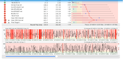
The graphs
A PingPlotter image (the combination of graphs you see on a target screen) should be your go-to first report. These images has been used by many, many thousands of people to communicate their problems to their provider.
If the image you see doesn't seem compelling, or doesn't capture the right picture, you may need to adjust your view. You can drag the time graph back, and focus is on a period that shows the problem. Depending on the problem, you might want to widen your view a bit to show periods of OK along with the periods of problem. Maybe 12 hours if your problem period is 6 hours, or 2 hours if it's 45 minutes. Right-click on the time graph to pick the appropriate time, then drag back and forth.
Once you have the time graph focused on the period you want, turn on the appropriate hop graphs. Hops that have latency or packet loss that isn't represented in the final destination (a topic we cover in more detail here) shouldn't be highlighted, while ones near the origin should be.
Once you've got that view, you can get the upper statistics to show the part you find important. You can leave it at "auto", which will have the upper and lower graph show the same time frame. Or you can switch the upper graph to a time period less than the lower graphs. If your lower graph is focused on 12 hours, you can set the upper one to 6 hours, and then double-click on the time graph to move the focus period. This will let you pick the statistics that show your problem and will also show the lead-in and exit to the problem.
Now span a picture via Edit -> Copy as image or via File -> Save as Image
This concept is more succinctly covered in our video tutorial.
There are ways to export, too, but the analysis tools coupled with the image creation tool really create a powerful case.
There are a few ways get a picture of your PingPlotter graph(s). The quick way is to select the “Edit” -> “Copy as image option” (which will copy the graph you’re viewing to your clipboard). The column and graph sizing will match up exactly to what you see on your screen - so make sure everything you want to show is explained. Another method is the “File” -> “Save Image...” option.
Statistical text export (inspired by command line traceroute)
In PingPlotter, you can choose the “Edit” -> “Copy as Text” option to copy the raw data to your clipboard. This is copied in a format that’s similar to *most* text-based trace route programs. It’s important to note: the “Focus” option on the main screen is used to decide how big of a period to include in this.
Comma delimited text file
This option is built to import into a program like Microsoft Excel - so you can manipulate the numbers and create output in different formats. To export a comma delimited text file, use the “File” -> “Export to Text File” option. From there, you’ll be able to specify the file you want to export (and a couple of other options). You can either export all samples in memory, or the range as specified on the main screen.
The “Include sample times in export file” option will specify whether or not to include the time each sample was taken at. If you don’t have this turned on, all of the samples will be output, but you won’t get corresponding times. Enable this option to include the times.
We discuss more reporting options in our knowledge base.